
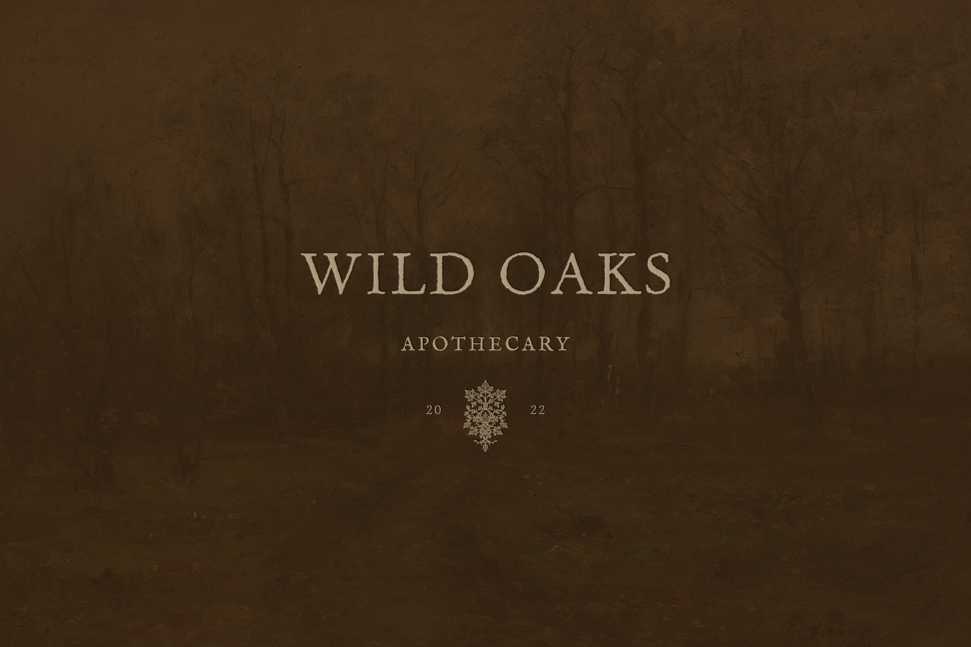
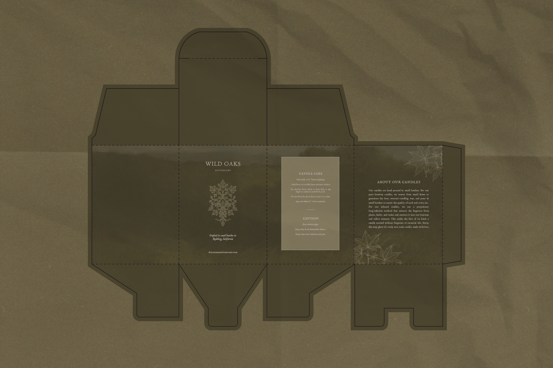


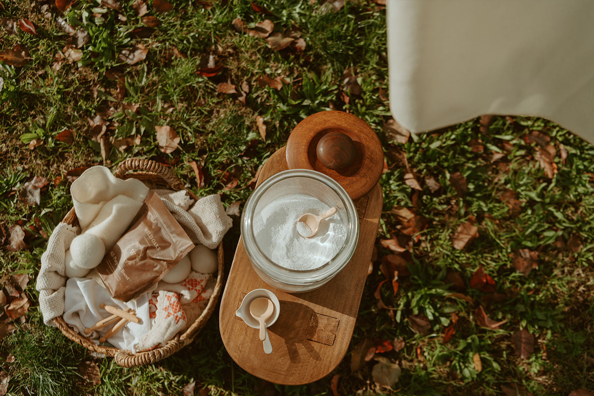
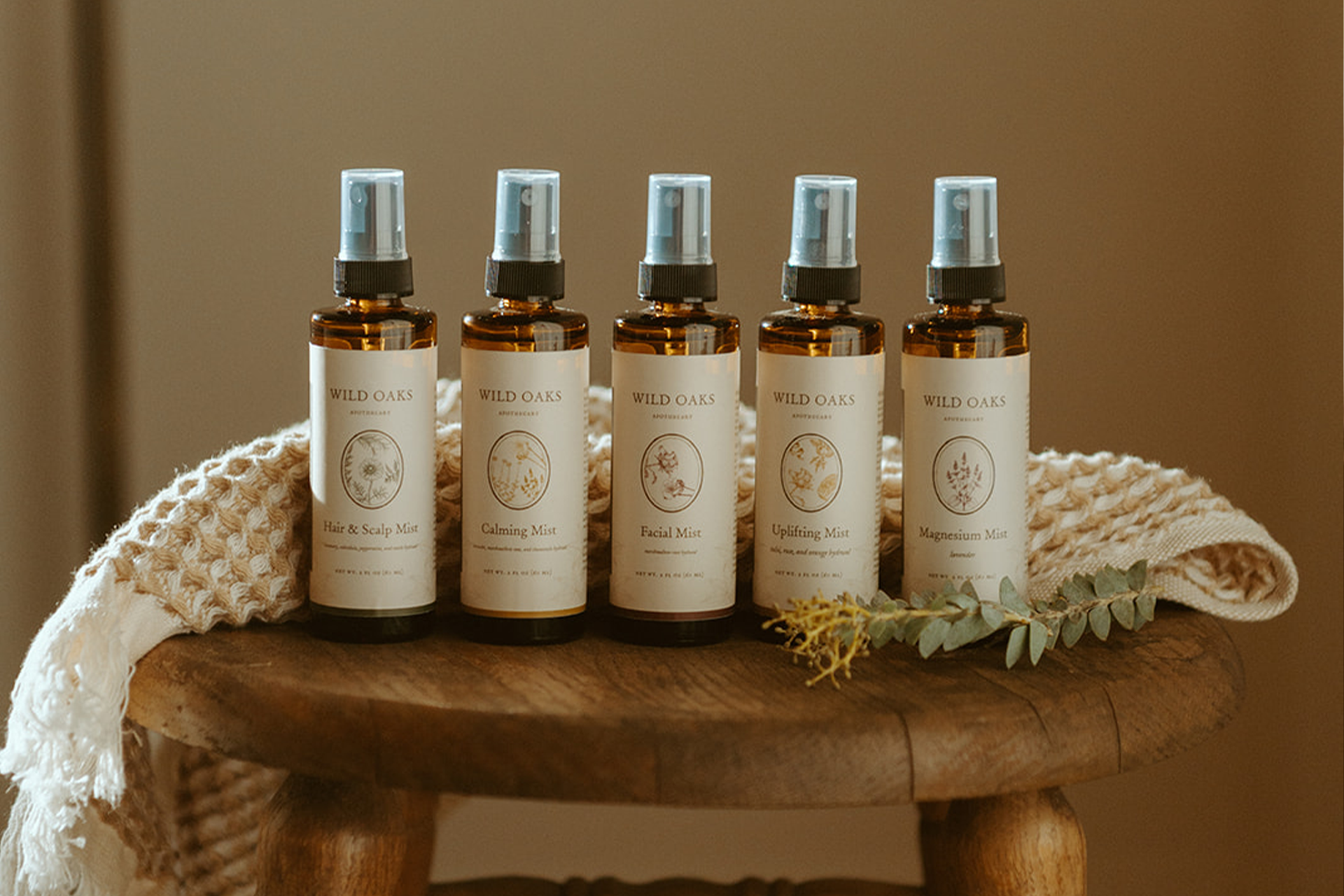

Wild Oaks Apothecary is a grounded sanctuary rooted in ancestral herbal wisdom and shaped for modern, intentional living. Designed to nurture the body, home, and daily rituals, the brand blends tradition with warmth, guidance, and quiet reverence for the natural world. We developed a comprehensive brand identity to reflect this vision, anchored in an earthy palette of olive greens, rich browns, cinnamon tones, soft peachy tans, and creamy neutrals, colors inspired by pressed botanicals, worn linens, and the comforting familiarity of a well-loved home.
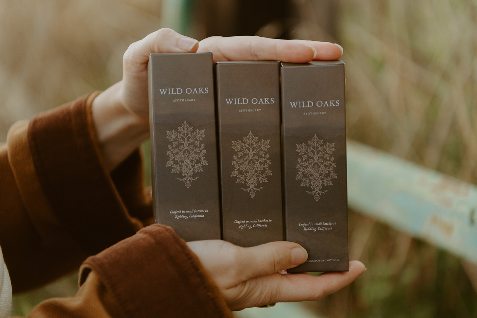
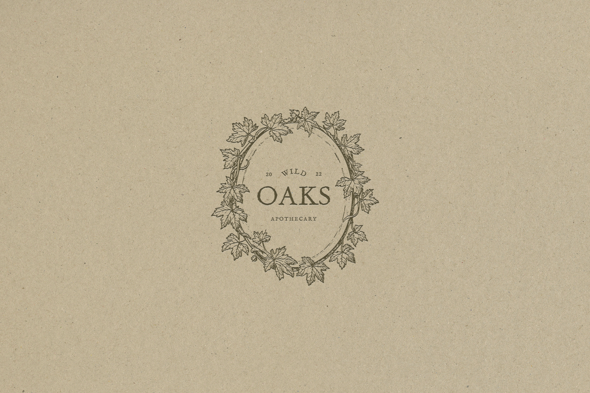
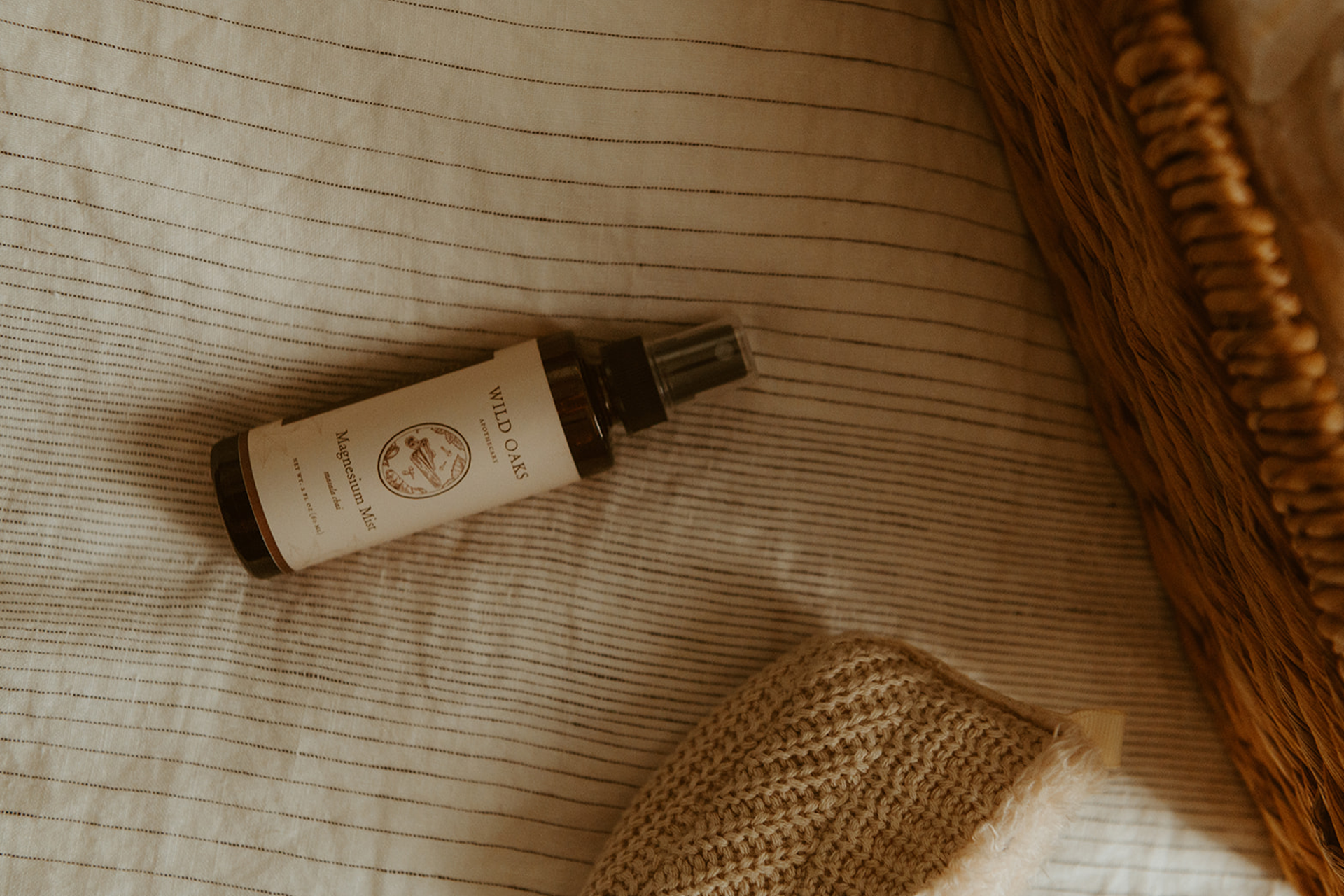
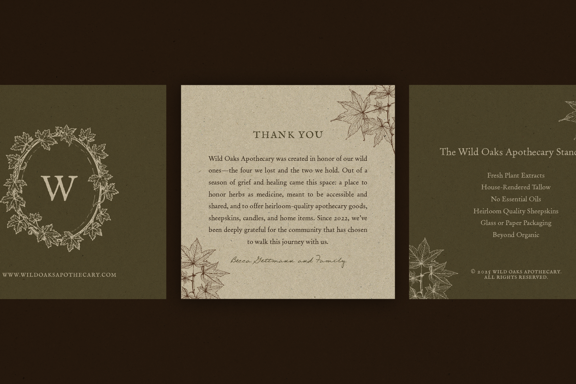
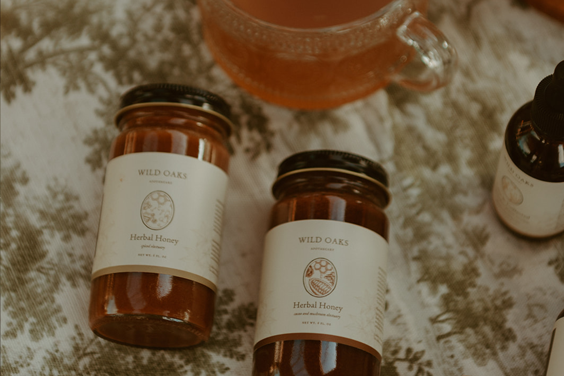
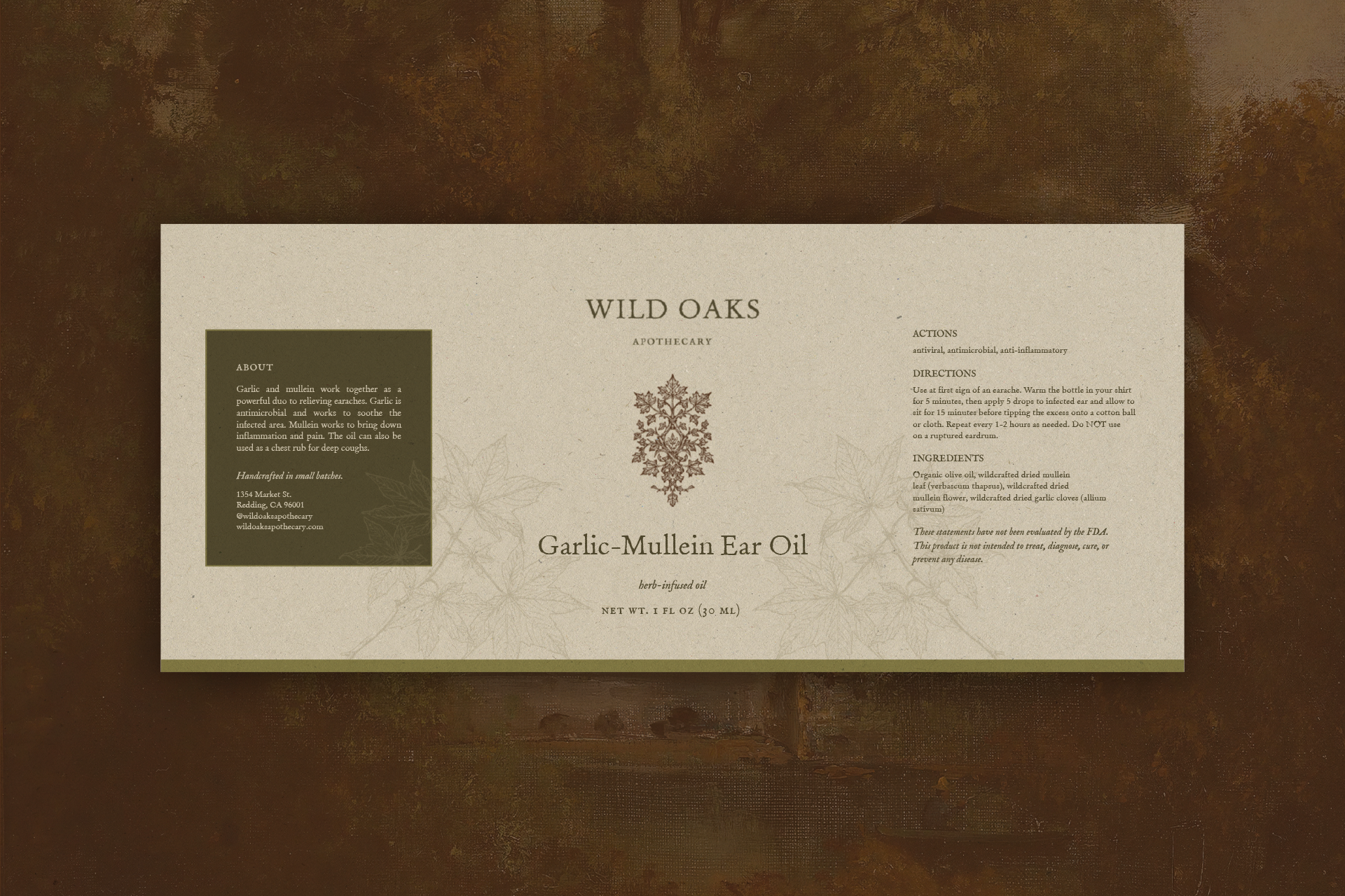
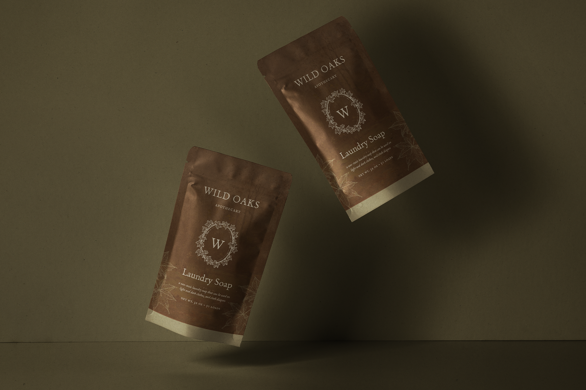
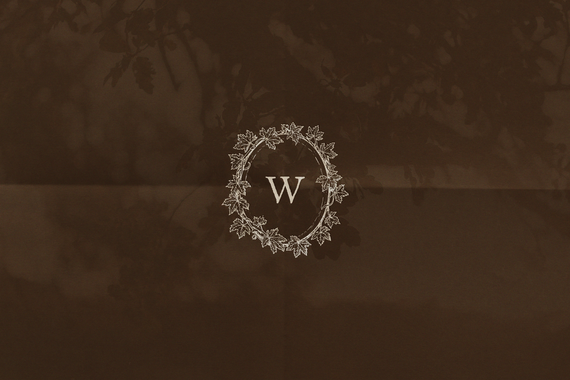
The logo suite was crafted with deep personal meaning, featuring a vintage-inspired oval wrapped in hand-drawn maple leaves and vines, honoring both family and remembrance. A custom botanical brand mark built entirely from maple leaf forms and a timeworn serif wordmark nod to inherited knowledge and the founder’s love of old books. Extending beyond the core identity, we designed a full suite of illustrated product labels across the entire apothecary line, along with supporting print and digital materials that bring cohesion, clarity, and care to every touchpoint. The result is a brand that feels timeless, nurturing, and deeply intentional, offering more than products, but a sense of ritual, trust, and belonging.
Full Branding, Packaging Design, Hand-Drawn Illustration, Logo Design, Product Label Design
Herbal Shop for Healing Remedies
Redding, California
Amber Moon Photo
It all felt like a warm hug to me. I don’t have any tweaks to offer! It feels like us, like me. The illustration is perfect. It feels so timeless and feels like it came straight out of a book. I love the symbolism and how calm yet ancient it feels. Thank you for being so incredibly thoughtful with how you’re honoring our babies and the vision behind the business.