

When it comes to building your website, one small detail that can make a big difference is how you handle your images. If your website is slow to load, chances are, large, unoptimized images are part of the problem.
Let’s talk about how to make sure your images are the right size for a fast, smooth website experience.
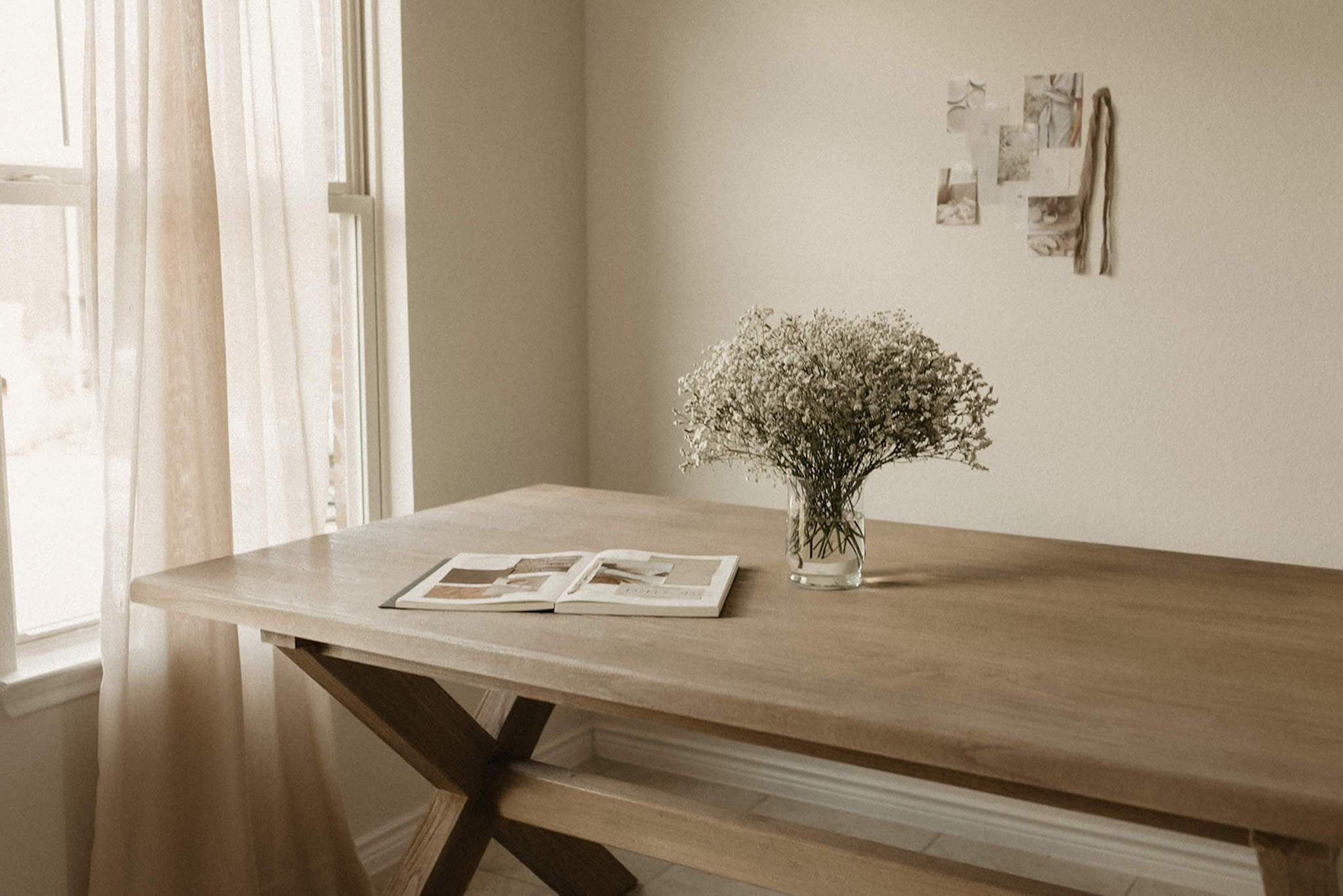
1920 x 1280 for Horizontal Images
This is a great size for wide, landscape images. It’s perfect for your homepage hero image (the big one at the top), background images, and any large visuals you want to feature. It also works well for blog post feature images.
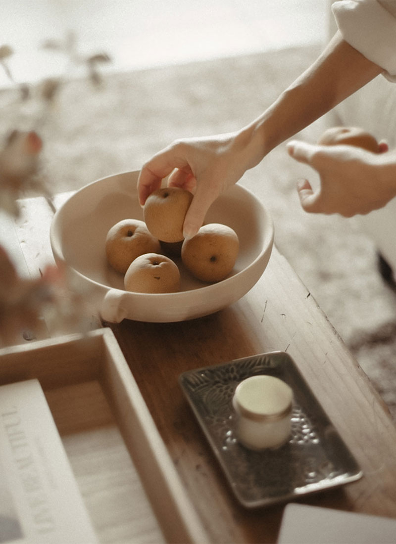
1280 x 1920 for Vertical Images
Vertical images are ideal for portraits, team photos, or product shots. This size works well for sections where you want the image and text to feel balanced. It’s a good way to break up content and make the page feel more visually engaging.
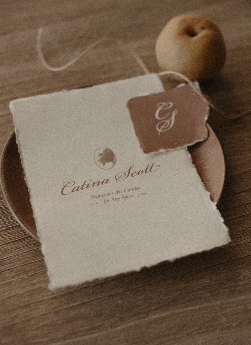
1280 x 1280 for Square Images
Square images are simple and versatile. They’re great for product photos, icons, or any image that you want to have equal width and height. This size is also a great choice for galleries or social media images on your website.
Why Does This Matter?
The goal is to make your life easier. By sticking to these sizes, you’ll know exactly what image to use for each section of your site. Plus, keeping your images consistent from the start means adding new ones later on is a breeze.
And while size matters, don’t forget to compress your images. Smaller file sizes make your website load faster, and a faster site creates a better experience for your visitors. You can reduce the file size without sacrificing image quality, which is key for a smooth website experience.
Putting It All Together
These three image sizes are a solid starting point for your website. But if you find other sizes work better for your site, feel free to adjust them! The goal is to keep things simple and organized, so you’re not guessing what image size to use when updating your site in the future.
If you need a helping hand in designing your website or crafting your holistic brand identity, reach out to us. We’d be delighted to join you on your wellness journey! Get started here if you are ready.